The Knob control allows to create potentiometers by using a Bitmap resource, a Section resource with frames, or a SVG resource. These frames are played as an animation when turning the knob. You can specify whether the Knob control reacts on its entire area or only on those parts where the alpha channel of the bitmap is bigger than 0 (Shaped). Furthermore, the movement of the Knob control can be inverted and set to be Scalable, which allows resizing of the bitmap. The Slider option can be used to display a pop-up slider when using the knob, which can be helpful when working with rather small Knob controls.
The name of the element. This name will be displayed in the GUI Tree.
Position/Size
Position X, Position Y, Width, Height: Position and size of the element in pixels. Position X/Y defines the position of the upper left corner.
Attach
Defines how an element behaves when its parent element is resized. You can set the following parameters:
Left: If the parent element is resized, the element remains attached to left edge, with the specified ratio.
Right: If the parent element is resized, the element moves relatively to the right edge, with the specified ratio.
Top: If the parent element is resized, the element remains attached to top edge, with the specified ratio.
Bottom: If the parent element is resized, the element moves relatively to the bottom edge, with the specified ratio.
Left + Right: If the parent element is resized, the element is resized horizontally relatively to the left and right edges, with the specified ratio.
Tooltip
Text that appears as a tooltip when the mouse hovers over the element.
Value
Drag and drop a parameter from the Parameter List to this text field to establish a connection. The assigned parameter will be displayed. Alternatively, you can export the property, which can then be used as a template parameter on a template instance.
Show Value
Activate this if you want to display a tooltip with the current parameter value when using the control. This option can be exported to the template level. The exported parameter can then be activated by setting it to true (the default is false).
Bitmap
Bitmap refers to:
An individual bitmap file in png or bmp format defined as resource.
A section, specifying a region within a larger source bitmap.
A SVG file defined as resource.
You can either select an existing resource or drop an image file onto the text field. In this case, the corresponding resource is created and set as reference.
Style
Invert: Inverts the knob animation.
Shaped: If this is activated, the control only reacts on filled pixels, transparent pixels with an alpha channel value of 0 are unresponsive.
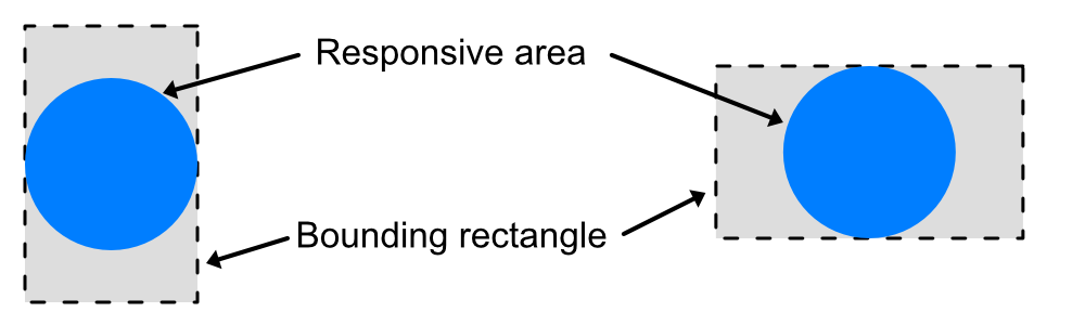
Rectangle: By default, the Knob control's reaction area is a circular area with a diameter of the shorter side of the the bounding rectangle of the Knob control, which is then centred along the axis of the longer side of the bounding rectangle. Activate this option if you want the knob to respond to mouse clicks in the entire bounding rectangle. (Since HALion 7.0)
Scalable: Activate this if you want to be able to resize the element. The assigned Bitmap resources are resized according to the Scale Mode that is defined for the respective Bitmap resource. The margin splitters are defined as for simple bitmaps, but the lower splitter must be set in the lowest subframe. On round knobs, leave margins on 0 and set the Scale Mode to stretch for the Bitmap resource. This way, the Knob control is resized as a whole.
Slider: Activate this option if you want to use a pop-up slider when adjusting the knob.