/ HALion Developer Resource / HALion Tutorials & Guidelines / How-tos /
Custom Multi-Level Menus II
(Since HALion 7.0)
On this page:
- Example VST Preset
- Prerequisites
- Overview of Templates
- Importing the Templates
- How the Elements Interact
This how-to describes another way to build custom pop-up menus. The solution shown can be used to build single-level or multi-level pop-up menus. An example of a single-level pop-up menu can be found in Working with Exported Variables.
The example below demonstrates how to build a custom multi-level menu for the oscillator type of the synth oscillator. The example is intended as an inspiration for you to develop your own solutions and ideas. You can adapt the look and feel, the number of menu entries, etc. by editing the corresponding templates.
Example VST Preset
Prerequisites
- Load a program with a synth zone.
- Open the Macro Page Designer and click Create New Macro Page/Library.
Overview of Templates
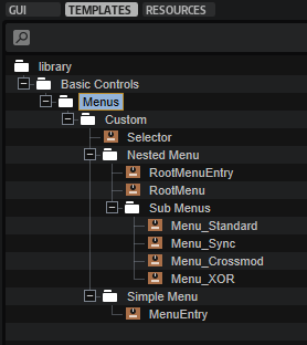
In this example, you will add the following templates from the Basic Controls library to the Template List:
Importing the Templates
- In the Resource/Library Browser, open the Basic Controls library and navigate to ./Menus/Custom.
- Drag the Selector template to your macro page.
- Set the Template Parameters of the Selector template as follows:
- Set Popup to 'RootMenu'.
- Connect Value to the Osc1 Type parameter, e.g.,
@0:Zone 1/@id:b0001. - Set Label to 'WAVEFORM'.
- Go to the Template List. Drag the following templates from the Resource/Library Browser to the Template List:
- Basic Controls/Menus/Custom/Nested Menu/RootMenu
- Basic Controls/Menus/Custom/Nested Menu/Sub Menus/Menu_Standard
- Basic Controls/Menus/Custom/Nested Menu/Sub Menus/Menu_Sync
- Basic Controls/Menus/Custom/Nested Menu/Sub Menus/Menu_Crossmod
- Basic Controls/Menus/Custom/Nested Menu/Sub Menus/Menu_XOR
The following templates will be added automatically:
- Basic Controls/Menus/Custom/Nested Menu/RootMenuEntry
- Basic Controls/Menus/Custom/Simple Menu/MenuEntry
If you have followed the described steps exactly, the menu should already work.
How the Elements Interact
Selector
The Selector template contains the elements which are required to open the RootMenu template and display the selected value.
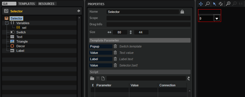
UI Variables
| Variable | Description | Type |
|---|---|---|
| sel | This variable is used by all menu entries of the pop-up menu. sel is exported as 'Value' and combined with the Value property of the Text control. As a result, the display string of the connected engine parameter will be displayed instead of the integer value. | Integer |
❕ For further information about exported variables, see Working with Exported Variables.
Controls and Subtemplates
| Element | Description |
|---|---|
| Switch | A Switch control that opens the pop-up menu. Its Popup Template property is exported as 'Popup'. This allows you to select which pop-up menu to open for each instance of the Selector template. |
| Text | A Text control for displaying the display string of the connected engine parameter. This is achieved by exporting the Value property as 'Value'. Since the sel UI variable is also exported as 'Value', both are combined into one template parameter, creating the interface for connecting the engine parameter. |
| Triangle | An Image control to indicate that a pop-up menu can be opened. |
| Decor | A Decor control used as background. |
| Label | A Label control for displaying the name of the connected parameter. Its Text property is exported as 'Label'. This allows you to name the Selector template differently for each instance. |
RootMenu
The RootMenu template is displayed when clicking the selector on the macro page. It defines the menu entries and opens the assigned Submenu templates when navigating through the menu.
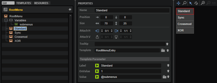
UI Variables
| Variable | Description | Type | Range |
|---|---|---|---|
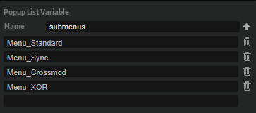
| submenus | This Popup List variable is required to assign the Submenu templates to the entries of the RootMenu template. The entries in the Popup List correspond to the names of the Submenu templates to be opened when navigating through the menu. The Popup List variable opens the assigned Submenu template when it receives the OnValue of the corresponding RootMenuEntry template. | String | Menu_Standard, Menu_Sync, Menu_Crossmod, Menu_XOR |
Controls and Subtemplates
| Element | Description |
|---|---|
| Standard, Sync, Crossmod, XOR | These represent the four entries of the menu. They use the RootMenuEntry template which defines the look and functionality of an entry. The Value parameter of all RootMenuEntry templates must be set to @submenus. The OnValue parameters of the specific RootMenuEntry templates must be set to the index of the corresponding entry in the Popup List variable. The OnValue will be sent to the Value parameter which is sent to the submenu Popup List variable which opens the corresponding RootMenuEntry template. The Label parameter defines the name of the entry to be displayed in the menu. |
RootMenuEntry
This template represents one entry in the RootMenu template. It consists of two elements:
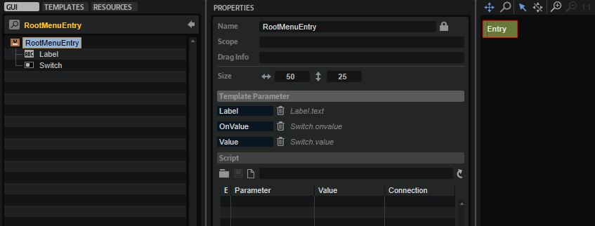
Controls and Subtemplates
| Element | Description |
|---|---|
| Label | A Label control to display the name of the menu entry. Its Text property is exported as 'Label'. This allows you to name the template differently for each instance. |
| Switch | A Switch control with hover exclusive mode which sends its OnValue when the mouse is above the menu entry. The OnValue and Value properties are exported to be set by each instance of the template. See RootMenu for details. |
Submenu
There are four submenu templates in the Template List: Menu_Standard, Menu_Sync, Menu_Crossmod, and Menu_XOR. Each Submenu template contains four MenuEntry templates that define the entries of the submenu.
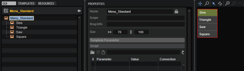
| Element | Description |
|---|---|
| Sine, Triangle, Saw, Square | These represent the four entries of the submenu. They use the MenuEntry template which defines the look and functionality of an entry. The OnValue parameter of each MenuEntry template must be set to the corresponding value of the engine parameter it selects. This value will be sent to the sel variable. See MenuEntry and Selector/UI Variables for details. The Label parameter defines the name of the entry to be displayed in the menu. |
MenuEntry
This template represents one entry in the Submenu template. It consists of two elements:
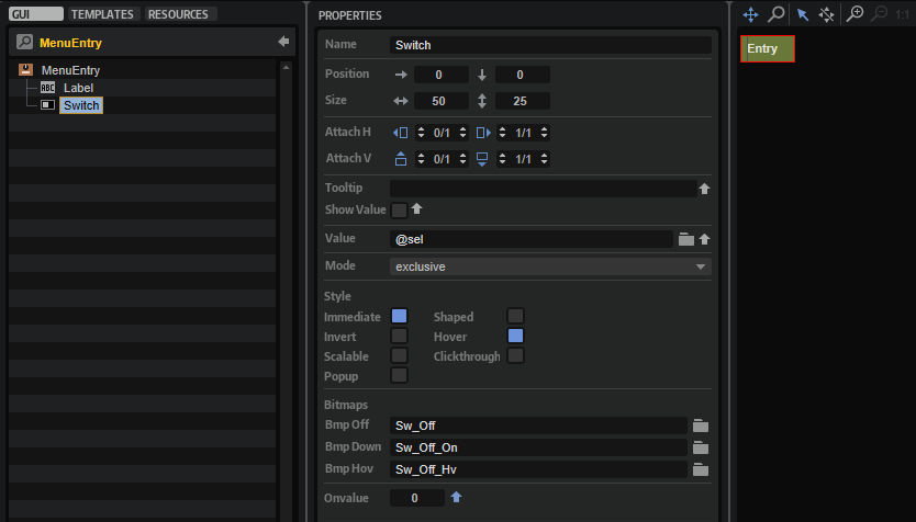
Controls and Subtemplates
| Element | Description |
|---|---|
| Label | A Label control to display the name of the menu entry. Its Text property is exported as 'Label'. This allows you to name the template differently for each instance. |
| Switch | A Switch control with exclusive mode. The OnValue property is exported to be set by each instance of the template. See Submenu for details. The Value property must be set to @sel, the UI variable of the Selector template. The OnValue will be sent to the Value parameter which is sent to the sel variable. As a result, the currently selected value will be sent to the Selector template which is connected to the engine parameter and the Text control within the Selector template shows the display string of the engine parameter. |
❕ Pop-up menus can only be displayed within the dimensions of the macro page. If a pop-up menu is too large, it will be clipped. To prevent this, you can either change the direction in which the pop-up menu opens, e.g., open it to the top instead of to the bottom, or you can change the size of the template, so that it fits, and then activate the scrollbar to be able to scroll to the available entries.