/ HALion Developer Resource / HALion Tutorials & Guidelines / How-tos /
Animating and Modifying SVGs
(Since HALion 7.0)
On this page:
By harnessing the capabilities of Lua expressions, you can animate controls that incorporate Scalable Vector Graphics (SVGs). Through the manipulation of SVG properties using Lua expressions, you gain control over how the values of these properties are modified within the control itself. This enables you to create dynamic and visually appealing animations that enhance the user experience.
Lua Expressions
An expression begins with $ followed by (). Everything inside the brackets will be evaluated and returns the effective value for the property.
$(expression)
You can use the following variables in Lua expressions:
| Variable | Description |
|---|---|
| N | The normalized value (0 to 1.0) of the control itself. |
| V | The value as sent by the connected engine parameter. |
| S | A string as sent by the connected parameter. |
The string of a S variable is set either by a stringlist variable or by MIDI script or UI script parameters. The ability to use the string output of a parameter allows you to transmit even a full sequence of values, such as the path of an object, for example.
Animating and Modifying SVG Properties
The following examples are intended as an inspiration for you to develop your own solutions and ideas.
Example VST Preset
To explore the templates in this example:
- Load Animating and Modifying SVGs.vstpreset.
- Open the Macro Page Designer, go to the GUI Tree and select the template you want to explore.
- Click Edit Element
 to examine the template.
 - Inside the template, select a Knob control, for example. Take a look at which Bitmap resource has been assigned.
- Go to the Resources Tree and select the corresponding SVG resource. Take a look at the IDs, properties, and values as listed below.
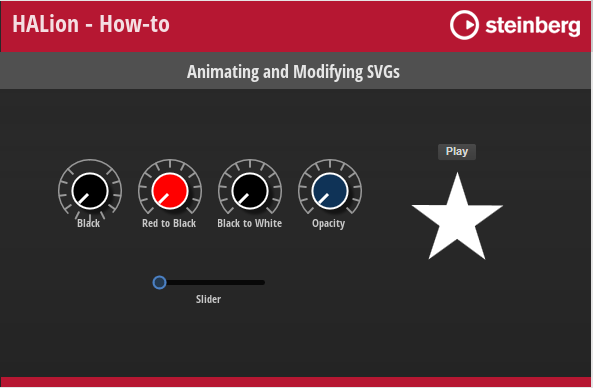
Changing the Fill Color of an Object
Knob Black
Resource: Knob11_Scale2_Green.
| ID | Property | Value |
|---|---|---|
| Knob | fill | rgb(0,0,0) |
Description: Static color, in this case black. The original color of the control was green.
Knob Red to Black
Resource: Knob11_Scale2_Red.
| ID | Property | Value |
|---|---|---|
| Knob | fill | rgb($(math.floor((1-N)*255)),0,0) |
Description: The normalized value (0 to 1.0) of the control scales the red channel from 255 to 0. This creates a fade from red to black.
Knob Black to White
Resource: Knob11_Scale2_Blue.
| ID | Property | Value |
|---|---|---|
| Knob | fill | rgb($(math.floor(N*255)),$(math.floor(N*255)),$(math.floor(N*255))) |
Description: The normalized value (0 to 1.0) of the control scales all channels from 0 to 255. This creates a fade from black to white.
❕ rgb values must be integer values, therefore
math.flooris used in the examples above.
Knob Opacity
Resource: Knob11_Scale2_Blue_1.
| ID | Property | Value |
|---|---|---|
| Knob | fill | hsla (220,75%,62%,$(1-N)) |
Description: The normalized value of the control scales the opacity from 1.0 to 0.
Rotating Star
Resource: Rotating Star
| ID | Property | Value |
|---|---|---|
| Stern | fill | $(SColor) |
Description: An animation control changes its color to the value set by the string output of the connected script parameter. $(SColor)is an additional SVG Parameter, see Animating SVGs with Additional Parameters for details. The following script switches between two colors.
function onSwitchChanged()
    if Switch then
        this:setParameter("FillColor", "rgb(255,0,0)")
    else
        this:setParameter("FillColor", "rgb(255,255,255)")
    end
end

defineParameter("Switch", nil, false, onSwitchChanged)
defineParameter("FillColor", nil, "rgb(255,255,255)")
Changing the Rotation of an Object
Knob Black
Resource: Knob11_Scale2_Green.
| ID | Property | Value |
|---|---|---|
| LineMain | transform | rotate(180,32,32) |
Description: The object is rotated by a fixed amount of 180 degrees around the center at x,y = 32,32 pixels. In this case, the scale is turned up side down.
Knob Black, Knob Red to Black, Knob Black to White, Knob Opacity
Resource: Knob11_Scale2_Green, Knob11_Scale2_Red, Knob11_Scale2_Blue and Knob11_Scale2_Blue_1.
| ID | Property | Value |
|---|---|---|
| KnobLine | transform | rotate($(-135+N*270),32,32) |
Description: A knob control rotates the object by 270 degrees with a start offset of -135 degrees, around the center at x,y = 32,32 pixels. In this case, the indicator of the control is rotated displaying the current value.
Changing the Position of an Object
Slider
Resource: Circle.
| ID | Property | Value |
|---|---|---|
| Circle | transform | translate(-0.5,0.5) |
Description: The upper left corner of the object is moved by a fixed amount, -0.5 pixels down and 0.5 pixels to the right. Here, it places the handle of the slider at the correct position.
Changing the Path of an Object
Slider
Resource: LightStrip H3Uni.
| ID | Property | Value |
|---|---|---|
| Path | d | M 0 9.5 L $(N*100) 9.5 |
Description: Draws a horizontal line using the normalized value of the control.